Black and white photography has many fans. They claim it is the only real art form, forgetting about other kinds of art.
One of them we want to talk about today.
Color photography is not something you can do well without practice. Contrast plays a very big role in this type. It’s very difficult to get it right if you don’t have any experience. Our article is great for beginners who are just getting started with color photography and photo contrast editors. Believe us, you will find a lot of useful information in it!
Let’s Start with the Definition
Let us embark on an exploration of fundamental principles in the realm of visual aesthetics, beginning with the distinction between tonal and color contrast. Allow yourself to immerse in the understanding that the first revolves around the divergence between the deepest shadows and the brightest highlights within an image, irrespective of their specific hues. Meanwhile, delve into the realm of the second type, where we unravel the interplay of vibrant hues that ignite the canvas. With each step, expand your perception and knowledge, unraveling the secrets that lie within the dynamic world of visual composition.
Imagine a circle with three colors on different sides: red, blue, and yellow. The closer you move your gaze to the center of the circle, the less vivid the hues of those colors become. Accordingly, the principle of color contrast is to choose different shades that complement each other. A prerequisite is that they must not conflict. Here are a few of the most popular combinations:
- Blue and red.
- Green and purple.
- Yellow and green.
Just imagining the combinations is difficult, so we advise you to try combining colors in the contrast photo editor. The best option is Luminar Neo. Its tool called Supercontrast can do wonders, so it should be used not only by beginners but also by professionals. It is able to change halftones, shadows, and highlights so precisely that you will be pleasantly surprised.
Why Use Color Contrast?
It’s very simple: it makes your pictures much better. We have prepared for you some of the most important reasons:
- Increase the visual interest of your picture. Viewers are always drawn to bright colors, so it’s the best way to get their attention.
- Help with communicating the theme. There’s no better way to draw attention to an object than by placing it against a contrasting background. It can be a light object against a dark background or vice versa. Use the contrast tool in the photo editor if you think the object has blurred into the background.
- Create depth and volume. By using colors that contrast with each other, you can create a sense of depth and make your photos look more three-dimensional. Naturally, it will attract more attention.
Ways of Using Color Contrast in Your Photography
Of course, you can always use photo editing for contrast, but we wouldn’t recommend relying on post-processing all the time. It’s much better to follow simple tips and do everything yourself. No, no, we are by no means saying that picture editing is bad, but it is very time-consuming. And it’s also a way to improve your photo editing skills, not your shooting skills.
So, here are some tips to help you achieve the perfect color contrast:
- Explore the mesmerizing allure of two-color images, where simplicity meets captivating visuals. Discover the innate presence of these striking compositions in our surrounding environment. Choose an object adorned with a vibrant and uniform shade, then juxtapose it against a backdrop of contrasting color. Engage in this exercise repeatedly, honing your ability to discern the interplay of hues. In due time, you’ll effortlessly stumble upon an arresting palette that effortlessly captivates the eye, unlocking your inherent talent for aesthetic composition.
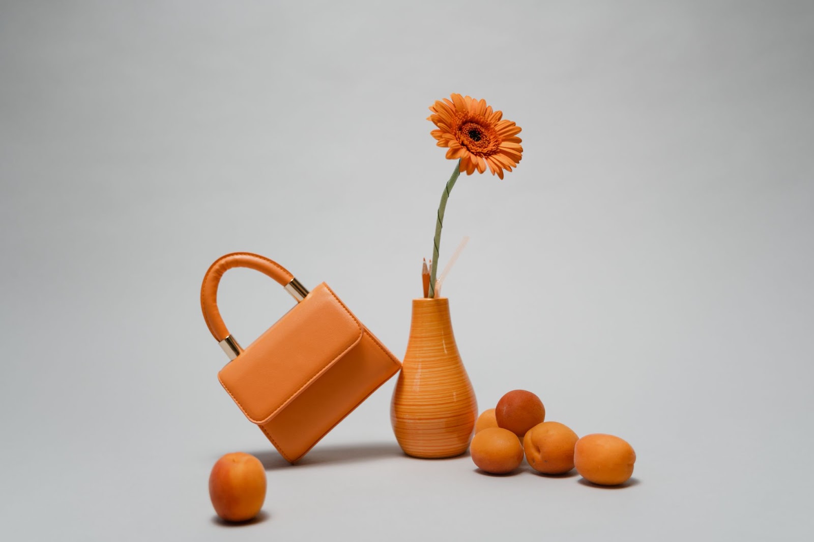
- Witness the captivating power of warmth conveyed through a kaleidoscope of red, orange, and yellow hues. These vibrant shades evoke a sense of coziness and comfort. In stark contrast, the cool tones of blue, green, and purple emanate a serene and refreshing ambiance. When these contrasting palettes intertwine, an enchanting miracle unfolds before our eyes.
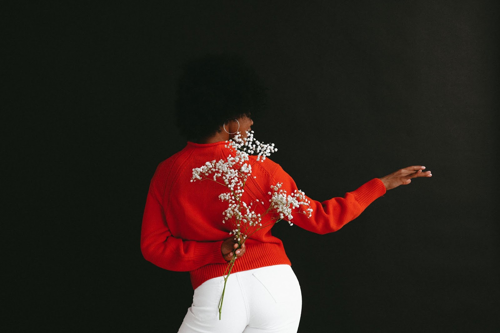
- The colors white and black are the only two colors that create a contrast with all the other colors. Don’t forget this when making a composition. Red and turquoise is also always a win-win combination.
These tips will be enough for you while you are just learning. We also advise you to pay attention to Johannes Itten’s color circle, which will help you first to understand the combinations and simplify your work. Of course, when you become a real professional, you’ll be able to find contrast without it, but at the beginning of your creative journey, it will be indispensable for you.
Wrapping Up
If you learn how to work with color contrast, then a further study of photography will be easy for you, and you will quickly show the world your amazing results. Practice, and look for inspiration. We are sure you will succeed!
This content is part of the HWM Partnership.

- Consumer Agency Sues R.G. Ortiz Funeral Home For Exploiting Grieving Families
- Senator’s Op-Ed: CUNY SPH’s Hub For Sexual And Reproductive Justice Gains Funding From NY State
- Harlem Invites The Community To New York Landmarks Conservancy 2024 Sacred Sites Open House
- Sponsored Love: Rare Carat, Best Diamonds To Buy
- Sponsored Love: Choosing The Best AI Tools To Enhance Your Videos
Become a Harlem Insider!
By submitting this form, you are consenting to receive marketing emails from: Harlem World Magazine, 2521 1/2 west 42nd street, Los Angeles, CA, 90008, https://www.harlemworldmagazine.com. You can revoke your consent to receive emails at any time by using the SafeUnsubscribe® link, found at the bottom of every email. Emails are serviced by Constant Contact