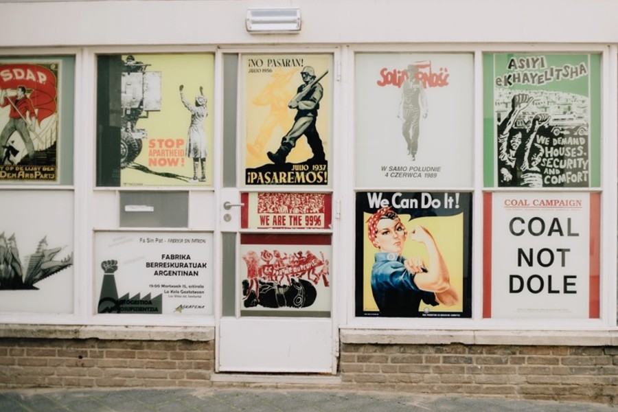
The purpose of a poster is to grab the audience’s attention and tell a story in a brief but creative way.
However, as a beginner, it can be challenging to achieve that feat on your own. As a result, you can create posters by VistaCreate by utilizing the app’s pre-made templates and other useful features.
Also, since people come across so many poster advertisements daily, they become somewhat desensitized to them. Nevertheless, occasionally, you do come across a poster that makes you stop and pay attention. That is the kind of poster that stays with you for a long time.
But what makes that poster stand out from the rest? What are the key components that form the backbone of a good poster? To find the answer to these questions, keep reading!

What Makes a Poster Design Impactful?
1. Hierarchy
Creating a visual hierarchy is one of the most important aspects of poster design. It is a way to arrange the elements in your artwork according to their significance. In this way, the spectator is directed as to what to read next, keeping their attention from wandering all over the poster.
2. Colors
Colors have their own separate language, and while everybody may know how to use colors, they may not understand the meaning behind those colors or what they represent.
Good poster designs make use of colors that complement each other. They have color palettes that unify certain elements in the poster while making others pleasantly stand out.
Since colors have a psychological impact on the viewer, it is important that they are used wisely. Clever graphic designers make sure that the colors in their designs match the theme of the poster while also being able to capture the attention of the audience.
3. Content
Posters are a way to relay information to the audience. An effective poster would present all the relevant information about the topic in a way that is captivating to the viewers. That being said, the content material should be easy to read and understand, as big chunks of complicated text only make people lose interest.
The advertisement, therefore, should be short, precise, and engaging. Remember, a successful poster is able to effectively communicate its message through the displayed content and leaves a lasting impact on the audience.
4. Layout
For a poster to be both visually appealing and technically satisfying, it is crucial to have a well-balanced layout. The layout can be of two types: symmetrical or asymmetrical.
Symmetry can be very aesthetically pleasing. Posters with perfect symmetry are quick to catch people’s eye as they convey a sense of balance, harmony, and order, whereas an asymmetrical layout adds a touch of drama and boldness to the poster design.
Asymmetrical layouts are a bit more complex, as there is a considerable amount of thought put into balancing the aesthetic impact of each element so that the audience does not get uncomfortable looking at the posters. Having said that, both layouts are equally effective at creating an impactful poster.
5. Typography
Typography describes the style or appearance of the font. In broader terms, however, it refers to the skill of employing the text in a way that makes it easily readable as well as visually appealing to the audience.
Since it is one of the most prominent aspects of a poster’s design, it would not be wrong to say that typography can make or break the aesthetic of a poster. And, people do frequently reject posters because they dislike the font style or find the text difficult to read.
However, as you may have noticed, impactful poster designs use typography in a way that will appeal to the viewer. These posters make sure to use typography in a way that is both consistent with the theme of the poster and adheres to the hierarchy principle.
6. Contrast
Contrast is created by placing two visual elements, that are notably distinct from one another together in one place.
It is one of the most widely used techniques in graphic design and is frequently employed with the purpose of grabbing the audience’s attention.
Creating a contrast not only adds to the aesthetic appeal of the poster but also helps in dictating where the viewer should focus their attention on the poster
Become a Harlem Insider!
By submitting this form, you are consenting to receive marketing emails from: Harlem World Magazine, 2521 1/2 west 42nd street, Los Angeles, CA, 90008, https://www.harlemworldmagazine.com. You can revoke your consent to receive emails at any time by using the SafeUnsubscribe® link, found at the bottom of every email. Emails are serviced by Constant Contact